UX design of a Free to Play Mobile Game
Brief:
Redesign of seasonal mobile game sale in a tight sprint deadline.
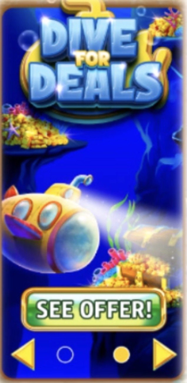
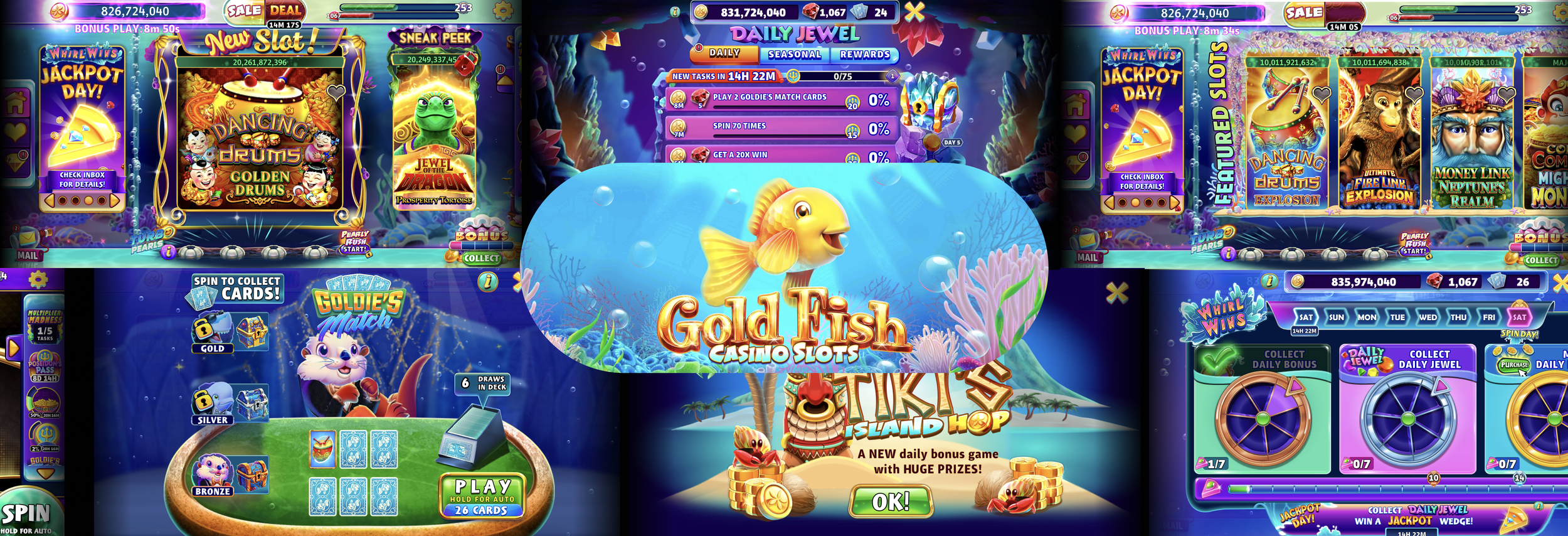
Free-to-play (F2P) mobile games such as Goldfish Casino Slots (GFC) often monetize through promotional sales offered to the player. Their vision sets them apart: A real-life casino experience in the form of a personal underwater adventure.
GFC requires a focus on its player base to create personal and cohesive moments in the game, and its monetization practices are not excluded from this process. The Dive for Deals promotional sale is no different. I contributed through UX/UI Design in Dive for Deals.
My major contributions were interactive design, informational hierarchy, and cross-collaboration with the Art, Product, and Engineering teams.
Role:
UX/UI Design and Research
For:
Achieved over 40$ per average number of Transactions Per Player (ATPPU) for 500K Daily players and increased revenue for 3 Item offer sales.
Company:
Sciplay
An older demographic that is already familiar with a casino or are curious about them.
This demographic is not familiar with video game mechanics, which means gentle guidance is a requirement.
Little patience for technical difficulties due to lack of technology knowledge and limitations such as glasses.
Game Refinery validates that a casino player follows three distinct motivators as well:
🤩 Excitement & Adventure
💪 Milestones & Completion
💎 Collecting Treasure
Demographic information
GFC is also mobile~ it can be played anywhere!
This gives a player freedom… but also means the player’s environment is going to vary wildly.
As a game, the player would use the game to increase excitement during a mundane task or to relax after work.
Some players may be easily distracted due to their environment and need the game to be easy to put down and pick up at any given time.
I want an easy to understand completion of milestones for a sense of accomplishment.
I want to feel like I made a good decision by purchasing coins in a free to play game.
I want to increase my excitement by collecting treasure after work.
As a GFC Player…
Some of the Ideations for Solutions Included:
A physical button to press for purchase of coins. It celebrates through audio and lights after a purchase. This button could pair via bluetooth with the player’s phone. This would be a great option for a player who struggles with technology and likes the physical part of being in a casino.
Tweaking the current mobile promotional sale for a sense of completion, collection of treasure and gentler technology forgiveness. Casino players like having everything available to one place, and this option would satiate this need.
A Smartwatch app that connects to GFC. Using bluetooth, this purchase option could utilize haptic feedback for an easy and satisfying purchase.
The reach for the player, value for the player, potential revenue, and effort from the team was considered in the Impact/Effort matrix.
I joined this project when the development schedule had fallen behind. To compensate for this, I weighted effort higher in my consideration.
By redesigning the original App sale for more personal touches, I considered it a ‘quick win’ compared to other unknown costs for the Smartwatch App and the Physical Button.
Business + Customers
For the sales design, it was important to combine the business and the customer needs. Customers who enjoy the sale section of the game often spin at high amounts and prefer thrill-seeker entertainment. For inspiration, I looked closely at entertainment media that fit the archetype such as Survivor.
Informational Hierarchy
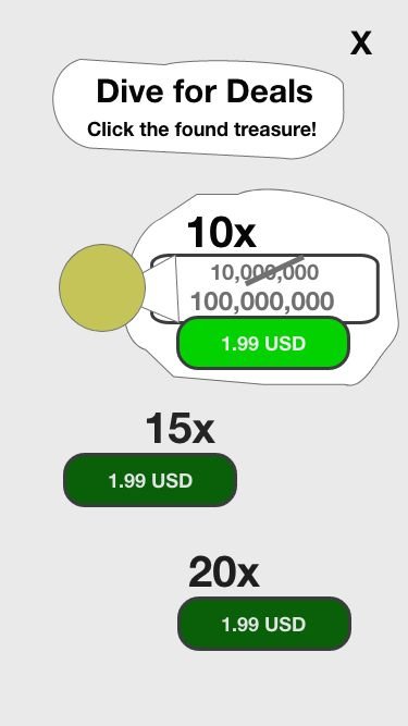
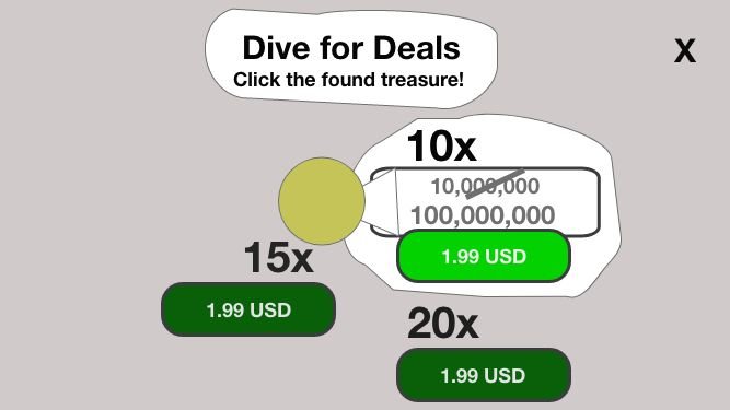
For the sale packages, I thought a top-to-bottom approach was more intuitive because the main audience was from the United States and would read left to right, top to bottom. The layout would also make it easier to flow down the page.
However, there was some pushback on this layout. The product team argued that Casino hierarchies usually have the largest prize at the top.
I provided two different styles to show both to the team.
Once the wireframes were displayed it became clear that a top down approach was a perfect style for diving for treasure, a concept that matched our understanding of the players. This also made the design more robust in Unity in that they could optimize future CTAs going down into the design as it scrolls past the viewpoint. I also experimented with portrait and landscape positions as the phone orientation was undetermined at this stage in development. The sale should be viewed from the lobby, which is in landscape mode but if accessed from a slot game that uses portrait mode, it would decrease the user experience to flip their phone when using the sale.
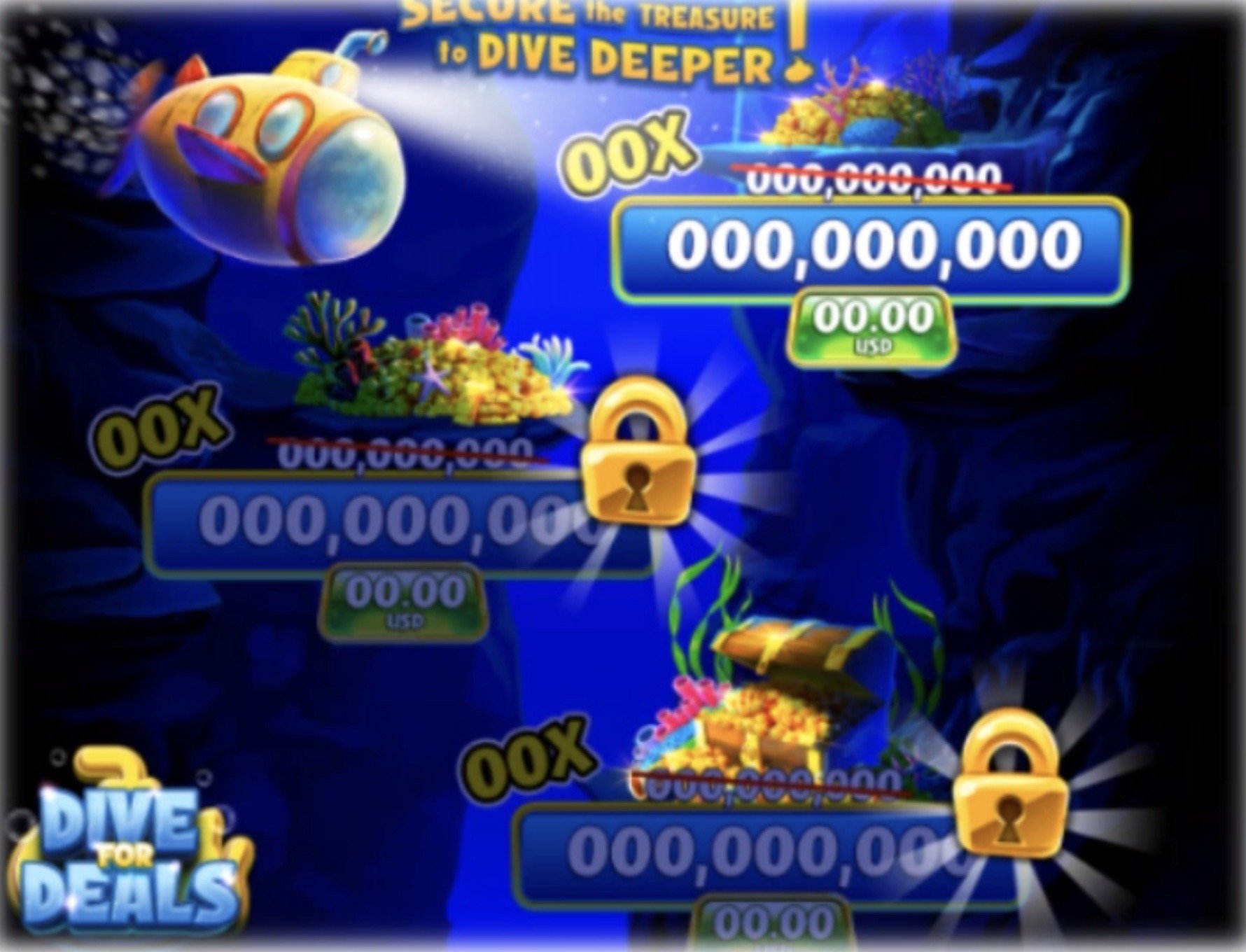
I made an interactive mockup in Figma to show the active highlighted sale should be most visible. I stated that light from a submarine made the most sense to highlight the active button. This also gave a reason for why the inactive buttons were darker.
Establishing Casino Ambiance
Another important point was that casino games historically use many eye-catching animations and color palettes, which if not used prudently can easily distract from the CTAs. With the diving for treasure concept discussed, I knew by using some of those elements could be used to keep the right CTA highlighted while still showing the other CTAs would become available. I suggested:
3. The checked bubbles after purchase is complete to remind players, as the majority log into the game in short sessions.
4. The opaque CTAs to show they are not active.
On a mobile device, the promotional sale would also be on both landscape and portrait, so using a 4:3 size, the design would be easy to translate across platforms, and this was factored into the design.
2. Locks that shake and shine when clicked to aid in identifying an intentionally locked sale.
1. Using a submarine with spotlight to guide the player’s line of sight.
Interaction Design also played a part in directing the player’s attention to the next CTA while also bringing focus on the current CTA.
This is best viewed by the video:
Validation:
While revenue was one of the business objectives for this AD, it was hypothesized to increase Average Transactions Per Paying User due to its three cascading multi-tiers.
Testing has demonstrated a net positive in revenue showcasing over 40$ per average transaction per player associated with the cascading offer, indicating success for both the players and the business.


